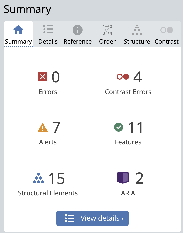
My experience with Wave Accessibility Check
The WAVE check highlighted some things I missed, like adding proper alt text for images, using clear headings, and improving color contrast. Although I can’t change the color settings myself because they’re part of the website design, I now realize how important contrast is for accessibility, especially for people with visual impairments.
In the future, I’ll make sure to add descriptive alt text for all images and use clear headings and ARIA labels to help with navigation. This experience taught me that even small adjustments can make my content more accessible for everyone, and I’ll keep these details in mind going forward.

My Reflection on Using Text-to-Speech Tools
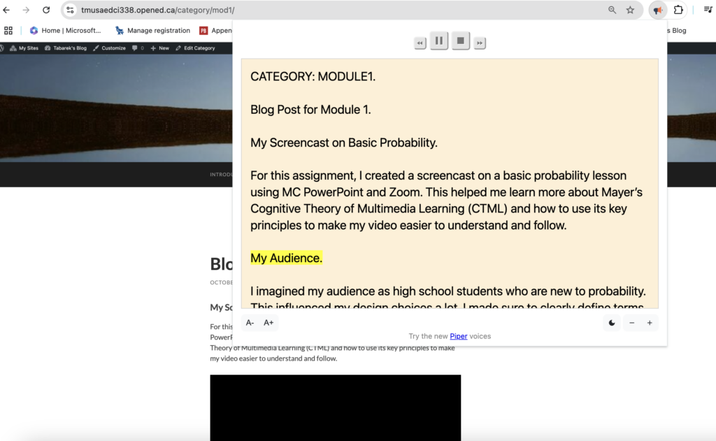
I have used a Text-to-Speech tool, and here’s a screenshot of my experience with it.

I hadn’t heard of this tool before, so trying it out was a lot of fun!
I can see how this tool would be very useful, especially for people who struggle with reading or have visual impairments. Having the text read aloud makes it easier to follow along and understand the content, making it a valuable tool for accessibility.
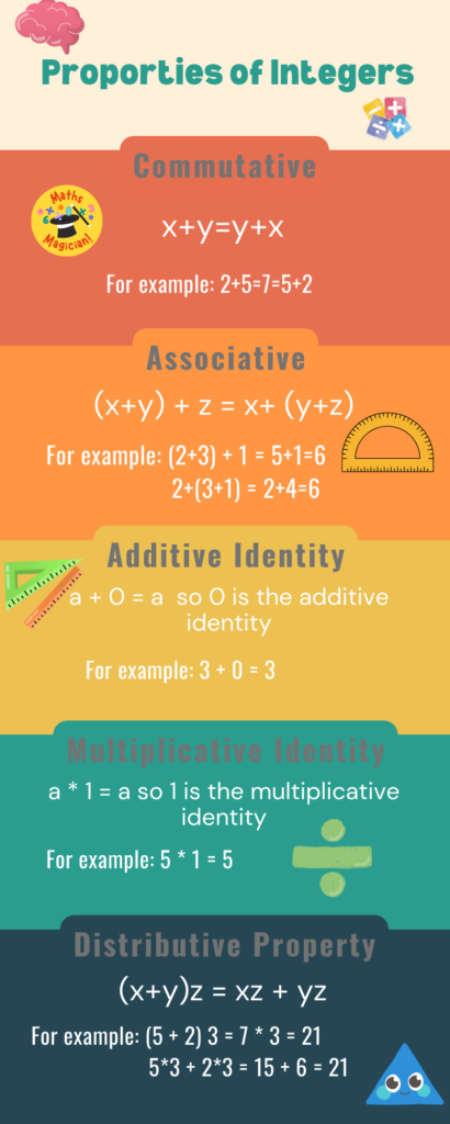
My Canva Infographic about proporties of the Integers

Design Principles Followed
I found this predesign in Canva but I made quite few changes on it.
I used a simple and consistent color scheme with warm tones to keep the infographic clean and organized. The layout flows logically from the title to each property, and I made sure the text and visuals were aligned to make it easy to read.
Elements of a “Good Infographic” Incorporated
I included clear headings, used visual icons to represent each property, and kept the information short and easy to understand. The examples also help explain each proporty clearly.
Influence of Target Audience
Since this is for students, I kept the language simple, used bright colors and icons to make it fun, and included examples to help them understand each property easily.
My Overall Reflection
Overall, these experiences have given me valuable insights into making my content more accessible and user-friendly. From adding alt text and clear headings to using intuitive design choices, I’ve learned that small adjustments can make a big difference.